|
Zee Updates SO! I may not have anything in the way of new layouts yet, but I did get creative and do a few more things for RLR. So, here they are!
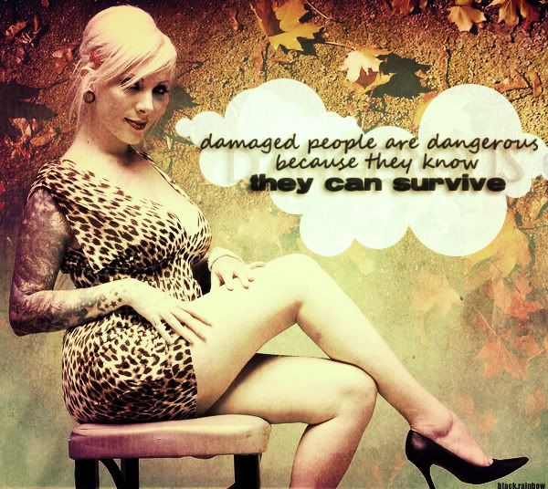
This is Maria Brink from In this Moment. If you like metal, and super hot chicks with tattoos, this band is for you  I liked how this turned out, sort of. I am not really sure. I liked how this turned out, sort of. I am not really sure.
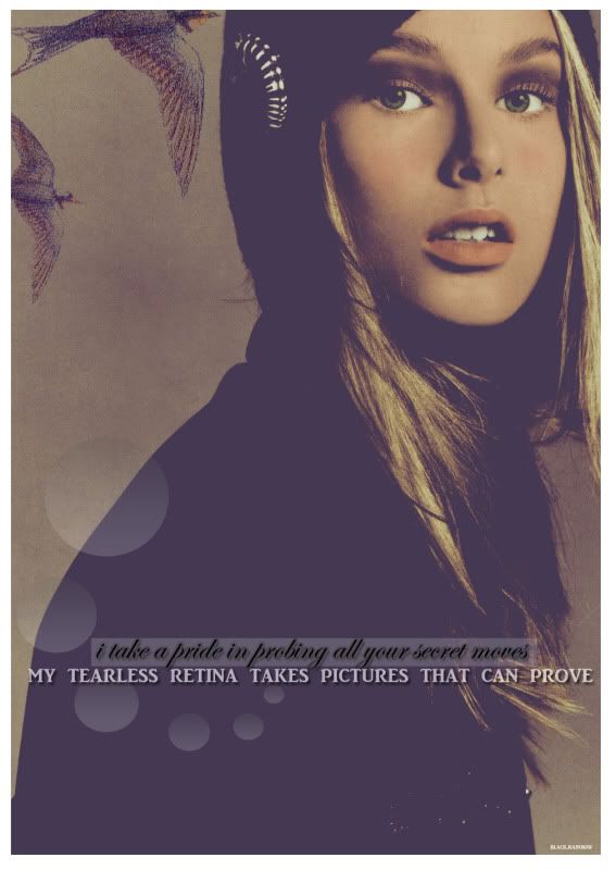
This was supposed to be a colorization, but, gah, I just don't really like it that much. I keep doing colorization to try and improve...but I am just not that great at it. Yet! We'll see.
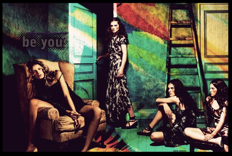
This one turned out great I thought, except the text turned out waaaaaaay too small, but it was too late to fix it by the time I realized. Oh well! I liked how it turned out.
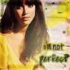
ALSO! ~themed LIMS results. My image:
Results
For:
Decent crop. Wish more of the head was in the picture. However, the text with her expression sold the icon. It really seems like that is what she could be saying.
Against:
nothing wrong with this icon, I am just not a fan of the color/gradient outline on the font.
While the background and textures added look good the text looks off. The yellow and green around the text feels a bit too much. Perhaps if it hadn't been as strong and dark it would've worked better. The text seems like it was just pasted on top of an image. Maybe try rotating it or putting the top line closer to the bottom one.
I agree with the comments, I am really trying to work on text because I have one standby effect and if I can't figure out something else to do I just revert back to it!
For added fun, remember my last entry with the funny picture of my friend? Well, clicky the links and check out two more that I did!
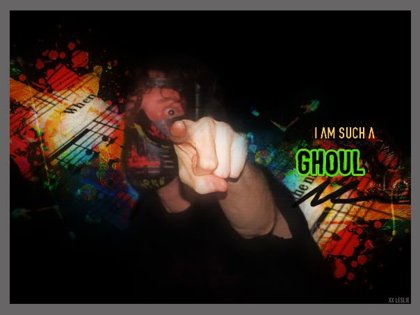
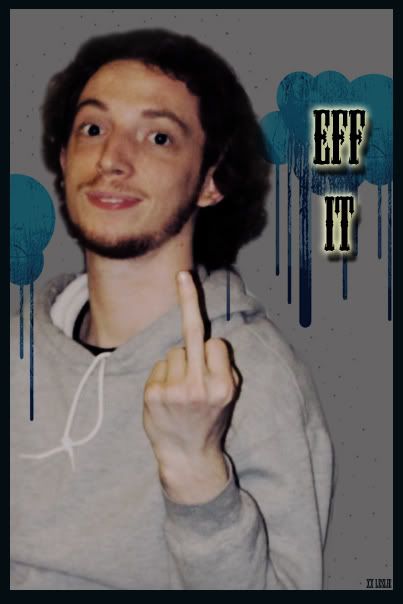
That's all for now! Cherish my long-ish update!
|

