Round 3; Challenge 1
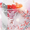
So, this was my submission and the comments on it (and below are the other ones I made, but decided not to use):
+3/-0= +3

For
-- I really like the texture and how there's color and black and white mixed together. It looks really cool and different.
-- For my favorite I really enjoy the third one, because of the colors blended and the brushes.
--#3 is the best. I love the effect of the icon

