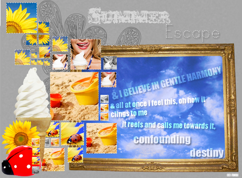
 the results the results

+5/-0= +5
For
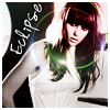
♥ I love the ring around her face. it really brings the attention to the center of the icon. the text just as well chosen out and the phrase.. perfect
♥ I love this icon because it is so simple. The small dash of colour created by the lens flare is enough to add a spot of interest to the icon. Its positioning around the model's face also helps create focus. The placement of the text is also good; it stands out against the background, but doesn't clash with or overpower the rest of the icon.
♥ nice crop, i like the way the texture matches the meaning of the text, and the text was placed nicely and easy to read
♥ I like the selective color use.  Very pretty. Very pretty.
♥ No reason given.
Well, this was my first time participating in a LIMS event. I was really surprised at the votes; I did pretty well. I don't feel like this is my best work, mostly because I'm not a fan of the the stroke I used on the font. But I am pretty excited for next round 
on another note: GO JOIN SQUARED CHALLENGES!. So far Keri and I only have 2 entries for 1 challenge (thank you Jessa and Teresa!).
Someone give them some competition, and join the other challenges while you are at it! 
-Ambi
 |

