 I'm a little behind in posting. I'm a little behind in posting.

+4-/3=+1
round 5
For
♥ The icon is creative and the tool requested in the challenge was well used.
♥ I love the font and brushes. Love how they used the smudge tool.
♥ I like how vibrant the colors are in this one. Even though there's text on it, it doesn't draw your eye before the subject, which is fantastic.
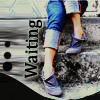
♥ The icon is well cropped and the word "waiting" is placed nicely. The icon is crisp and clear and not overdone. It's well thought out and executed perfectly.
Against
♥ The use of the blur (or smudge?) tool seems messy. Instead of the decorative brushes, the icon maker could have focused more on making the technique the focal point of the icon, since that was the point of the challenge.
♥ The colouring and contrasting of the base image is relatively good. However, I feel this icon failed with the text and border. The word 'Waiting' stands out too much and is too stark a contrast to the rest of the image. I suggest decreasing the font size (and perhaps changing the font face) and removing the white stroke around the text, and perhaps adding a softer, wider, less opaque stroke around the whole word to make it legible. The curved border is actually quite nice in its own right, but, like the font, is too stark against the base image and doesn't blend well. (And just so you know, I don't think the icon is actually that bad! It is just because with the reduction in numbers, the standard of icons is increasing.)
♥ I hate picking this one as my least favourite, because I really like it, but all the icons are so good this round! I love the colours in this icon and the dark design along the bottom and left side - it's just the text that bugs me a little bit. I'm not sure if it's the font that was used or the way it's placed, but I find it a bit distracting from the main subject. Other than that, great job!

+4/0=+4
round 6
For
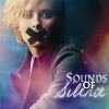
♥ The font of the text is perfect, and its placement is perfect as well. The texture adds a nice pop of color, and the crop is artistic.
♥ I like the softness to it and the different fonts that they used for the words. It isn't hard to read and the icon has just enough things in it to make it stand out.
♥ The soft quality of the icon is really nice, while still making the facial expression visible and the focus of the icon. The text effects are beautiful.
♥ This icon is crisp and clear, yet also soft and light, which is a hard combination to make work together well. The texture adds the perfect amount of colour to the icon, and the tape "x" over the models mouth is well placed and looks like it could have been a part of the original image. Finally, the difference in font and font colours used in the text matches the whole "theme" of the icon and brings it all together. Wonderful icon!
Well, for round 5 I didn't use a blur tool. I really liked my icon; I used the sponge tool to desaturate the background, and saturate the legs. I was going for a "color splash" *that's what they're called? And then I cut a section of the picture, dragged it to stretch it out, and set it to overlay. I don't know. I was proud of that icon, because it was the first of that kind I created, and I don't think the brushes distracted from what I intended my focal point to be; they were only framing it.
I am in utter shock for round 6. I didn't like my icon leading to, and post submitting it. I was struggling with finding the right crop for the image, which I feel still isn't good. Then, compared to all the others, I felt my image wasn't sharp enough and too soft, and .... mushy. Can you describe an icon as mush? I think so, lol. Like it's made of jelly. Haha. But still.... this was my first win, so I guess I did something okay... This challenge is getting harder and harder, because there are so many talented people to compete with.
And with that, I will call it a night.
Ambi
|

