TLIMS challenge 7 | 03/20/2010 |
TLIMS
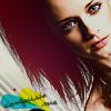
Well I made it into the final challenge of TLIMS once again! YAY! I was really worried this time... I made like a billion icons until I decided on what I entered. lol And even then I wasn't at all sure of it. Here it is:
+2/-2= 0
For
The crop and diagonal placement of the image gives this icon a lot of energy, and I love the splash of colours i
I love how this icon includes so many diverse colours yet still manages to make them work in the small space. The splash of red light on the hair compliments the blue and yellow brushes behind the text. The text is large enough to be noticed but not too large and overpowering. The striped texture adds extra depth to the icon. The crop is also interesting; I like how the model's face is off to the side and in the corner rather than front-row-centre
Against
This was a very hard round to choose for me. But personally, I just really don't like the crop on this. Her hair seems to be the focal point of the icon, and the red is just a bit too jarring for me.
I do like this icon, but when it's compared to the other three, it's lacking. Perhaps if Alexis' face was larger in the icon, it would be a little more eye-popping.
My comments
I guess this one of those icons that you either liked or disliked! lol I loved the picture and her hair in the picture, so I actually wanted to include her hair in the icon because I thought it was a significant part of the picture. But I can understand how someone could not like that.
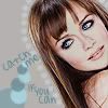
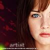
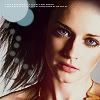
Below are some of the other crappy icons I made before deciding on this one. lol (Some are unfinished, and some were never going to be submitted anyway.)
| | | | |
|
[01] |
[02] |
[03] |
[04] |
 |
 |
 |
 |
[05] |
[06] |
[07] |
[08] |
 |
 |
 |
 |
[09] |
[10] |
[11] |
[12] |
 |
 |
 |
 |
[13] |
[14] |
[15] |
[16] |
 |
 |
 |
 |
|
|
|

